Find the SQL Server Deadlock Objects That Keep Colliding
A query that ran fine all morning suddenly returns error 1205, and by the time you pull up the session list, whatever it collided with is long gone. A few days later it happens again, on what looks like a completely different pair of tables, and you start to wonder whether the SQL Server deadlock objects involved are actually connected to each other or just unlucky. Restarting the job clears it every time. Nothing in the plan cache explains why.
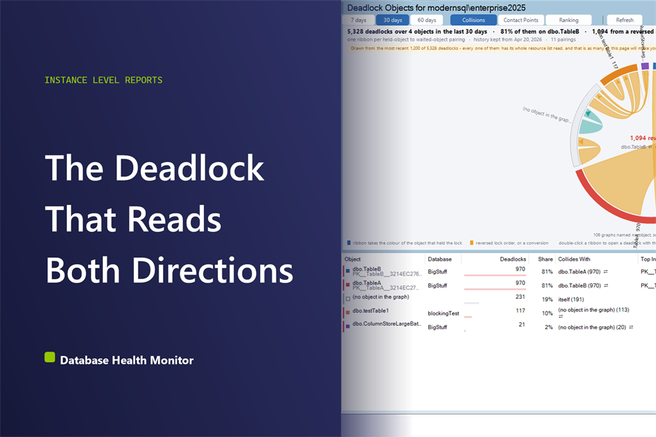
How do you find which SQL Server deadlock objects keep colliding with each other? SQL Server deadlock objects are the tables and indexes that collided inside a deadlock cycle, found by reading the owner and waiter lists in every deadlock graph. Database Health Monitor's Deadlock Objects report reads that history and draws each pairing as a directed link, showing which object was held and which was waited on, across every database on the instance.
The obvious move is to pull up the graph SQL Server already captured and read it top to bottom: the two statements, the two session ids, the lock modes, which side became the victim. That graph is accurate, and it's also a dead end on its own, because it only tells you about the one deadlock you happened to catch. It says nothing about whether this is the third time this week or the first time in six months, and nothing about whether the same two objects are colliding somewhere else in the application that nobody happened to be watching. Read enough of these one at a time and every deadlock starts to look like a one-off, right up until it isn't.
What actually answers the question isn't one graph, it's the pattern across all of them: which pairs of objects keep showing up together, in which order, and on which index. A deadlock that happens once is bad luck. The same two objects colliding in both directions, week after week, is a design decision nobody has made yet, and the honest number is how often a pairing repeats, not how dramatic any single graph looks. That's true whether the two objects are tables, indexes, or a table colliding with itself, and it's easiest to see across weeks, not across a single 3 a.m. page.
In this post
- How the SQL Server Deadlock Objects Report Draws the Picture
- Why Run This at Instance Scope
- Three Views: Collisions, Contact Points, and Ranking
- The Two Shapes Worth Finding
- Reading the Grid
- Where the Numbers Come From
- What the Common Patterns Actually Mean
- What to Do With What You Find
How the SQL Server Deadlock Objects Report Draws the Picture
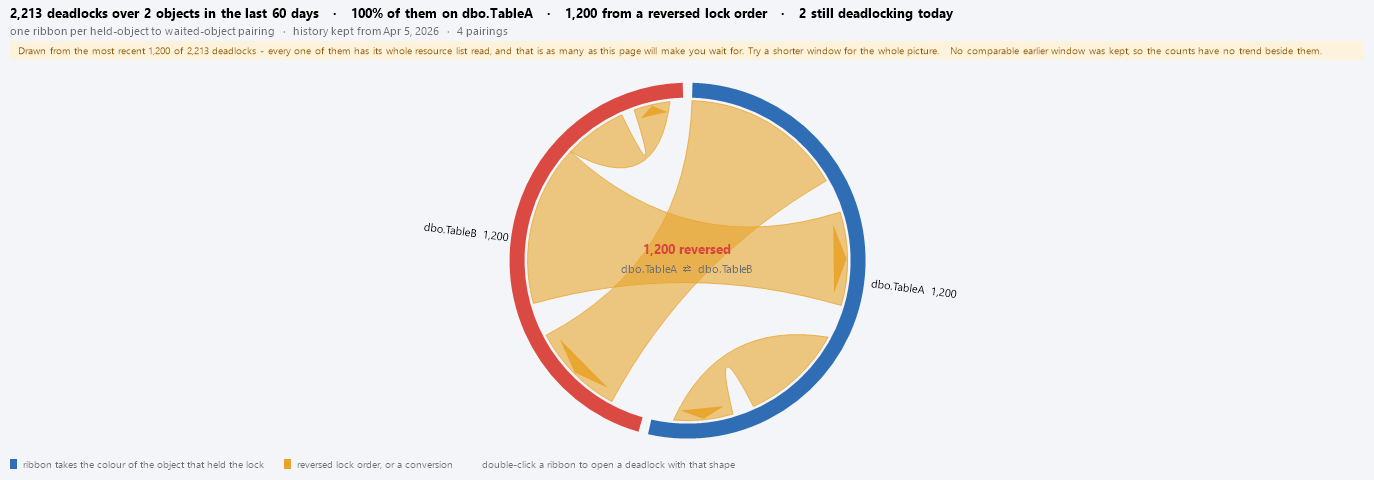
Database Health Monitor's Deadlock Objects report is built around that pattern instead of a single graph. It reads every deadlock recorded against the instance and draws the objects involved as a ring, one arc per object, sized by how much traffic passed through it. Directed ribbons connect the ones that collided, running from the object a process was holding to the object it was waiting on, so the direction of the collision is visible without a legend. Where two objects have ribbons running both ways, that's the shape worth stopping on.
Deadlock Objects is one of the reports in Database Health Monitor. It runs against your own servers, and it takes about a minute to have this same screen open on one of them.
Why Run This at Instance Scope
A pairing that crosses two databases can't show up on the database-scoped version of this report, since a page filtered to one database only ever sees half the picture. Picture a transaction that touches a row in one database and then reaches into a second database while another process does the same thing in reverse: that's the shape a linked server call or a distributed transaction produces, and it never shows up anywhere except here, because half of it lives outside whichever single database you'd otherwise be looking at. The instance-scope page also carries a Database column the per-database version doesn't need, because 'dbo.OrderLine' in two different databases is two different problems that would otherwise land on identical-looking rows.
It's easy to assume Deadlock History already covers this ground, since it ranks objects by how often they turn up. But a rank order can't show you a pairing, only a count, and a reversed lock order only exists as a relationship between two rows that a simple ranking never puts next to each other.
Three Views: Collisions, Contact Points, and Ranking
The ring is the default view, called Collisions, but it's one of three ways to look at the same window of deadlocks.
- Collisions draws the ring: one arc per object, one ribbon per held-to-waited pairing, colored by whichever object held the lock
- Contact Points splits each object's bar by the index its locks were taken on, turning a vague finding into a specific one
- Ranking is the plain list: useful when there are either too many objects for a readable ring or barely enough to draw one, with each bar sorted by which side of the pairing usually loses
This is where a vague finding becomes a specific task. Knowing an object deadlocks often doesn't tell you what to change; knowing that almost two-thirds of those locks landed on one particular index tells you exactly where to look next. A segment with no index name is drawn hatched instead of colored, since a heap or a table-level lock isn't an index with a blank name, it's the absence of one.
Ranking answers a third question: which side keeps losing. Each bar there is split by which side of the cycle was waiting when SQL Server picked a victim, with a strip underneath showing when the deadlocks actually happened. An object that's almost always on the losing side is the one whose retry logic is doing all the work, quietly, while the other side of the pairing never notices.
The Two Shapes Worth Finding
A reversed lock order shows up as the same two objects paired in both directions: one code path always takes A before B, another always takes B before A. Run them concurrently long enough and they interleave. The fix isn't an index or a query hint, it's an ordering rule: make both code paths take the two objects in the same sequence, and that change almost always lives in just the two statements the pairing points to.
When two transactions reach for the same pair of tables but grab them in a different order, a collision is only a matter of time, not luck.
A lock conversion happens when a process is already sitting on a resource and then reaches for a stronger lock on that exact same resource, most often a SELECT inside a transaction that circles back to UPDATE the row it just read. Fixing it means taking the stronger lock up front instead of reordering anything, which is why the report tracks conversions separately from reversed pairings instead of lumping them together.
Reading the Grid
Every arc in the ring has a matching row in the grid, which is where the numbers actually live. Deadlocks counts how many times this object was touched in the window; Share turns that into a percentage of everything the report read. Collides With names its most frequent partner and how often they pair up, and a small arrow flags when that pairing runs in both directions. Top Index shows which index absorbed most of its locks, blank when it's a heap or an object-level lock instead. Victim Side shows how often the process waiting on this object was the one SQL Server picked to kill. The grid can show the same object twice if it lives in two different databases, because its identity always carries the database with it.

- Deadlocking now flags an object that had a deadlock sometime in the past 24 hours
- Chronic means it deadlocked on at least 60 percent of the days in the window, spanning three days or more
- Quiet means nothing has touched it in 14 days or more
- No object in the graph means the deadlock graph itself never named an object, so it's drawn hatched rather than left blank
'First In Window' and 'Last Deadlock' mark the span and how recent the last one was, and 'vs Previous Window' compares against an equal stretch of time right before this one, when retention goes back far enough to support it.
Where the Numbers Come From
The report never queries the monitored instance directly. Everything on screen comes from 'DBHealthHistory.dbo.DeadlockHistory', assembled from 'system_health' extended events data collected every fifteen minutes, which is also why there's no auto-refresh button here: the window spans weeks rather than seconds, and refreshing on a timer would just re-read the same history to redraw a picture that hasn't changed. Every deadlock graph inside the window gets its complete resource list parsed, lock by lock, to work out who was holding what and who was waiting, which costs more than a simple tally would, so when a window gets too big to finish in time, the notice band on screen reports how many of the most recent deadlocks it actually managed to read before it stopped. That's a disclosed limit, not a silent one. The window itself toggles between 7, 30, and 60 days, saved separately from the per-database version so the two pages don't fight over one setting, and switching between Collisions, Contact Points, and Ranking repaints data already in hand rather than firing a new query each time.
What the Common Patterns Actually Mean
A few shapes turn up often enough to be worth recognizing on sight.
| What you see | What it usually means |
|---|---|
| Two heavy ribbons running in both directions, marked amber | Two competing code paths taking the same two objects in opposite order |
| A ribbon whose two ends land in different databases | Usually a distributed transaction, or a call across a linked server |
| One object with a ribbon looping back to itself | The same table touched by rows in a different order each time, often caused by an IN list or a cursor |
| An amber loop sitting on a single object | A SELECT followed by an UPDATE that lands back on the very row it just read |
| One arc noticeably wider than every other | A single hot object worth checking in Contact Points before reaching for a new index |
Double-clicking a ribbon or a grid row opens the most recent graph with that exact shape, and the right-click menu can also copy the underlying query to the clipboard, narrowed down to one object, so anyone doubting the chart can run the same read themselves in SSMS. If the deadlock is recent enough that the sessions involved might still be connected, Who Is Connected to SQL Server, and What They're Doing covers how to see exactly who's on the instance right now.
What to Do With What You Find
By design, nothing here can act on the monitored instance, only read from its history. The middle of the ring is where to look first: a named reversed pairing usually means a half-day of work, not a redesign. If the middle is empty, Contact Points and Ranking are where the slower, chronic problems tend to surface instead. The chart itself can be copied to the clipboard too, which matters more than it sounds like when the fix depends on convincing two different teams that their code is the one colliding.
What to check on your own server
- Confirm your instance is running SQL Server 2016 or newer, since deadlock history depends on the system_health extended events session
- Pull your most recent deadlock graphs and check whether the same two objects appear in both directions
- Note which index the locks concentrate on before assuming a new index is the fix
- Check whether one side of a pairing is consistently the victim, not just which object appears most
Try Database Health Monitor Today
It turns a pile of one-off deadlock graphs into a single picture of which two objects keep colliding and in which order. Database Health Monitor shows it on every instance you connect, in the time it takes to open the report.
Download Database Health Monitor and run the Deadlock Objects report against your own server. There is nothing to configure first, and you will know inside a few minutes whether it tells you something you did not already know.