I/O by Database
Overview
The I/O by Database report answers one question: which database on this instance is being made to wait on storage, and how badly?
For every database on the instance it reads the SQL Server file I/O counters and rolls them up per database, split four ways – data reads, data writes, log reads and log writes. It then ranks the databases by time waited, draws them as a diverging bar chart with reads running left of a centre axis and writes running right, and colours every bar by the latency band its storage falls into.
Ranking by time waited rather than by bytes moved is deliberate, and it is the whole point of the report. A database moving 400 GB at 2 ms per operation is healthy. A database moving 8 GB at 90 ms per operation is the call you are about to get. Volume alone cannot tell those two apart; time waited can.
The report is a live look at the instance. It queries the monitored SQL Server directly each time it loads or refreshes. Nothing is written to a repository, and no data collection job has to be running for the report to work.
Where to find it
The report is reached from several places in Database Health Monitor.
| Route | How |
|---|---|
| Server tree | Right-click the server → Instance Level Reports → I/O by Database |
| Server Overview page | Click the I/O by Database report link |
| Server Overview page | Click the Database I/O bar chart panel |
| I/O by Drive | Right-click a drive or its rollup bar → Open I/O by Database |
| Related Links bar | From Disk Latency, Databases by Size, Disk Space, File Utilization and I/O by Drive |
| Report arrows | Previous is File Utilization, next is I/O by Drive |
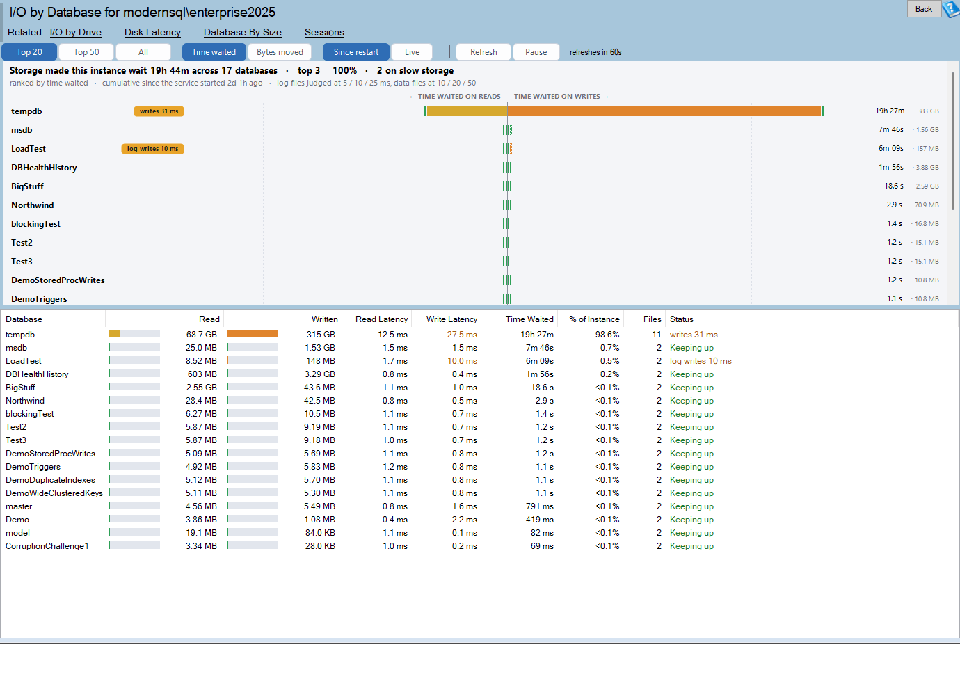
The page title reads I/O by Database for <server name>. Clicking the help button on the title bar opens the online version of this page at https://databasehealth.com/server-overview/instance-level-reports/io-by-database/.
The chart from this report is also captured into the SQL Server Health Report advisor output, so it appears in the exported health report document.
Requirements
- The monitored instance must be online and reachable. Database Health Monitor checks this before the report opens and tells you if the instance is unavailable.
- The login used for the connection needs
VIEW SERVER STATEon the instance. Without it the dynamic management views return nothing and the report reports the permission problem rather than an empty page. - The query is given 60 seconds to complete. On an instance with a very large number of files, or one under heavy pressure, a timeout means the instance was too busy to answer – not that there is nothing to see.
- Nothing needs to be installed on the monitored instance. No repository database, no agent job, no collection schedule.
Two of the things the report shows degrade gracefully when permissions are partial:
- A database whose name cannot be resolved is listed as
database id 7rather than being dropped. These rows have no drill-down, because there is no name to drill into. - Volume information is read through a separate call that is wrapped in error handling, so one offline or inaccessible volume does not cost you the whole report.
Reading the chart
The chart sits above the grid and shows one horizontal row per database.
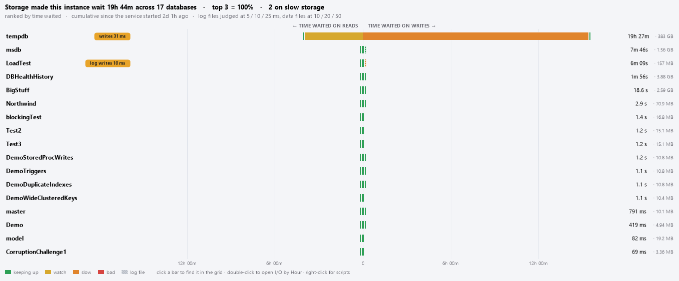
The shape
Bars diverge from a centre vertical axis at zero:
- Reads run left. The axis caption reads
<- TIME WAITED ON READS. - Writes run right. The axis caption reads
TIME WAITED ON WRITES ->.
When the measure is switched to bytes, the captions become <- BYTES READ and BYTES WRITTEN ->.
Each wing is made of two segments:
- The segment against the axis is the database’s data files.
- The segment outside it, drawn with a diagonal hatch and separated by a thin seam, is the database’s log files.
Hatching, rather than a different colour, is used for log files because colour is already carrying latency and cannot carry two meanings at once. The legend shows a hatched swatch labelled log file.
All rows share one absolute scale. Bars are not normalised per row, so a database that waited ten times longer than the one below it draws a bar ten times as long. That is what makes the chart scannable: length is comparable everywhere on the page.
Gridline ticks are placed at readable intervals – 1, 2, 5, 10 or 25 ms and upward through seconds, minutes, hours and days for time; powers of 1024 for bytes – with labels mirrored on both sides of zero and 0 at the axis.
The header lines
Above the bars are up to three lines of text.
The summary line states the total and where it is concentrated, for example:
Storage made this instance wait 3h 35m across 42 databases · top 3 = 61% · 4 on slow storage
The top 3 = ...% figure is the most actionable number on the page. One database holding a third of all the waiting tells you exactly where to start. The on slow storage count appears only when at least one database is in the slow or bad band.
The subtitle line states what the numbers actually cover, for example:
ranked by time waited · cumulative since the service started 6d 4h ago · log files judged at 5 / 10 / 25 ms, data files at 10 / 20 / 50
In Live mode the middle clause becomes live - the last 60 seconds only.
The notice band is an amber strip that appears only when something would otherwise mislead you:
- Live is armed – the first live figures need a second sample, and appear at the next refresh. Until then these are the cumulative totals.
- SQL Server restarted 3h 12m ago – these I/O totals only cover since then. This one appears whenever the instance has been up for less than 24 hours, because a short uptime makes every total look small and every comparison unfair.
Colour and the latency thresholds
Colour on a bar segment is the average latency of that direction, not its size.
| Band | Data files | Log files | Meaning |
|---|---|---|---|
| Keeping up (green) | under 10 ms | under 5 ms | Normal. Nothing to do. |
| Watch (amber) | 10 – 20 ms | 5 – 10 ms | Slower than you would like, not yet a problem. |
| Slow (orange) | 20 – 50 ms | 10 – 25 ms | Worth investigating. |
| Bad (red) | 50 ms and over | 25 ms and over | The rows this report exists to find. |
| No traffic (gray) | – | – | Zero operations in this direction, so there is no latency to judge. |
Log files are held to a tighter standard on purpose. Log writes are synchronous and serialised – every commit waits on one. Fifteen milliseconds on a data file is unremarkable; fifteen milliseconds on a log file is throttling every write in the database.
These are the same thresholds the per-file charts elsewhere in Database Health Monitor use, so a file that reads amber there does not read green here.
If you have colour-blind mode enabled the report uses a muted, colour-blind-safe palette; in dark mode every colour has a dark-background variant. The bands and the thresholds are identical in all three modes.
Chips
To the left of each bar, in the name gutter, a short chip may appear – for example log writes 34 ms or reads 61 ms. The chip names the single worst thing about that database: whichever of data reads, data writes, log reads or log writes has the worst band, and within a tie, the worst average.
Chips appear only for databases in the slow or bad bands. A database whose storage is keeping up gets no chip at all. That is intentional – amber on everything says nothing. Running your eye down the gutter gives you the problem list and nothing else.
The rollup bar
When there are more databases than the current Top N, everything past the cut is combined into a single gray bar at the bottom labelled 27 more databases. The bars therefore still add up to the whole instance, and you can see at a glance whether the tail is negligible or whether it quietly holds half the waiting.
Double-clicking the rollup bar switches the report to All so you can see what is inside it.
Chart interactions
| Action | Result |
|---|---|
| Hover a bar | Tooltip with the full breakdown (see below) |
| Left-click a bar | Selects the matching row in the grid and scrolls it into view |
| Double-click a bar | Opens I/O by Hour for that database |
| Double-click the rollup bar | Switches to All |
| Right-click a bar | Per-database menu, plus Copy Chart to Clipboard |
| Right-click empty chart space | Copy Chart to Clipboard only |
The tooltip gives the numbers the bar cannot:
AdventureWorks
18.4% of the instance · 4 files

Reads 1,204,882 ops · 41.2 GB · 2m 14s waited
Writes 318,447 ops · 9.8 GB · 1m 02s waited

Average latency
  data reads 3.1 ms writes 8.4 ms
  log reads 0.4 ms writes 31.7 ms
The chart grows with the number of rows up to a maximum height, then scrolls rather than shrinking the bars into illegibility.
Reading the grid
The grid below the chart carries the same databases in the same order, with the exact figures.
| Column | Units | What it is |
|---|---|---|
| Database | – | Database name, or database id N when the name cannot be resolved. |
| Status | – | The same wording as the chart chip, or Keeping up when nothing is slow, or blank when the database did no I/O at all. |
| Read | bytes (KB/MB/GB/TB) | Total bytes read from all of the database’s files, data and log. Drawn with an in-cell bar. |
| Written | bytes (KB/MB/GB/TB) | Total bytes written to all of the database’s files, data and log. Drawn with an in-cell bar. |
| Read Latency | milliseconds | Average time per read: total read stall divided by total read operations. Shows - when there were no reads. |
| Write Latency | milliseconds | Average time per write: total write stall divided by total write operations. Shows - when there were no writes. |
| Time Waited | ms / s / m / h / d | Read stall plus write stall across every file in the database. This is the default ranking column. |
| % of Instance | percent | This database’s share of the instance total for the current measure. Values under 0.1% display as <0.1%. |
| Files | count | Number of database files, data and log together. |
Layout. Status comes straight after Database, and the wide bar columns follow it, so the verdict for each database is on screen at 1280 x 900 without scrolling sideways. Database and Status are capped in width, and the full text of any row shows in the tooltip when the mouse rests on it.

How the numbers are computed
- Latency averages divide by the operation count only. Some older scripts add one to the denominator to dodge a divide-by-zero; that quietly understates latency, so this report does not do it. Where there were no operations, the cell shows
-instead of a number. - Bytes are true bytes from the SQL Server counters, displayed with 1024-based units.
- % of Instance uses whichever measure is selected in the toolbar: share of total time waited, or share of total bytes moved. The denominator is the whole instance, including databases that are not shown because they fall past the Top N cut.
- Databases with no I/O at all are not listed. They are not findings, they are noise. They are still counted before being dropped, so the instance totals stay honest.
Highlighting
- The Read and Written columns each draw a horizontal bar behind the number, scaled against the largest byte value currently on screen and filled with the latency-band colour of that direction. This lets you see the split between volume and pain in one glance.
- Read Latency and Write Latency print the number itself in the band colour when that direction is slow or bad, and in the normal text colour otherwise.
- Status is red for a bad row, orange for a slow row, and green for Keeping up.
Sorting, filtering and copying
- Click a column header to sort by that column; click again to reverse it. Sorting uses the underlying raw values, so
3h 35msorts as more than842 msrather than as the number 3. - Right-click a column header for Filter… and Reset Filters.
- Right-click in the grid for the standard grid actions in addition to the report-specific ones:
- Copy – the selected rows
- Copy with Headers – tab-separated, ready to paste straight into Excel
- Select All
- Filter ‘<column>’ and Reset Filters
- Double-click a row to open I/O by Hour for that database.
Selecting a row in the grid highlights the matching bar in the chart, and vice versa.
The toolbar
The toolbar sits above the chart. The active choice in each group is shown pressed.
Top 20 · Top 50 · All
How many databases get their own row before the rest are rolled into the tail bar. All shows up to ten thousand databases. Changing this re-cuts the data already on screen – it does not re-query the instance, so switching does not disturb a Live window that is in progress. The choice is remembered between sessions.
Time waited · Bytes moved
Which measure drives the ranking, the bar lengths, the tick labels, the axis captions and the % of Instance column.
- Time waited (the default) is the problem list. It ranks by the milliseconds the instance spent waiting on storage.
- Bytes moved is the workload list. It ranks by throughput and tells you which databases are actually driving the I/O.
The two together are the useful comparison. A database near the top of one list and the bottom of the other is telling you something specific.
Switching measure does not re-query either – both numbers are already in hand.
Since restart · Live
This is the most important control on the page, because it changes what window the numbers describe.
Since restart (the default) shows the counters as SQL Server keeps them: cumulative since the service last started. This is available the instant the page opens, and it is what most SQL Server file I/O scripts show. Its weakness is that it describes history, not now – a reindex two weeks ago is still the tallest bar.
Live keeps the previous sample and draws only the difference between the two, so the page answers what is happening rather than what has ever happened.
Points worth knowing about Live:
- The first Live reading needs two samples. When you arm Live, the amber notice band appears, the cumulative totals stay on screen, and the first live figures arrive at the next sample – pulled forward to 10 seconds so you are not waiting a full interval.
- The baseline rolls forward on every refresh, so a Live window always covers exactly one refresh interval rather than growing from when you opened the page.
- If a counter goes backwards – which means the SQL Server service restarted under you – the report discards the comparison and starts again rather than drawing a meaningless negative.
- Live window lengths are measured with the server’s clock, not your workstation’s, so a clock difference between the two does not distort the rates.
The Live and measure choices are shared with the I/O by Drive report on purpose. The two reports are two views of one set of counters, and following a link from one to the other is not a change of mind about what you want to be looking at.
Refresh and the countdown
Refresh reloads immediately. Next to it a label counts down – refreshes in 42s, or next sample in 8s in Live mode. The report refreshes on its own every 60 seconds by default.
An auto-refresh is suppressed while a right-click menu is open, so rows are never torn out from under a menu you are reading. A refresh also keeps your selected row selected, tracking it by name, because ranking positions reshuffle between samples.
Right-click actions
The same three per-database items appear whether you right-click a bar in the chart or a row in the grid.
| Item | What it does |
|---|---|
| Open I/O by Hour for <database> | Opens the historic per-database I/O report. |
| Copy Database Name to Clipboard | Just the name. |
| Copy File I/O Breakdown Script to Clipboard | Puts a read-only T-SQL script on the clipboard that reproduces this row file by file, worst waiting first, for running in SSMS. |
| Copy Chart to Clipboard | (chart only) Renders the whole chart as an image and puts it on the clipboard for pasting into a ticket, an email or a report. |
The breakdown script is deliberately read-only. There is no action to script here, because the fix for slow storage is never a single statement. It returns one row per file with logical name, physical path, whether it is data or log, size, read and write counts, bytes, stall totals and computed averages.
Copy Chart to Clipboard renders the chart at a generous fixed width regardless of how narrow your window is, so the pasted image keeps its value columns and full labels. It is placed on the clipboard in both bitmap and PNG form so it pastes correctly into Word, Outlook, Teams and image editors alike.
How to read the report
A workable order for a storage complaint:
- Check the subtitle first. Cumulative or live? How long has the instance been up? Every conclusion below depends on the answer, and a two-hour-old instance cannot tell you much.
- Read the summary line. How much waiting is there in total, and how concentrated is it? If the top three databases hold 61% of the waiting, the other thirty-nine are a distraction.
- Scan the chip gutter. Chips are the problem list. No chips means no database is in the slow or bad band, whatever the bar lengths look like.
- Look at which side the bars are on. A long read wing is a workload that is not being served from memory. A long write wing is checkpoint, log flush or backup pressure.
- Look for hatching. A hatched segment that dwarfs the solid one means the log file, not the data file, is where the time is going – and a slow log throttles every commit in that database.
- Switch to Bytes moved and compare. High waiting with low volume points at the storage. High volume with proportionate waiting points at the workload.
- Switch to Live. If the shape changes completely, what you were looking at was history. If it holds, the problem is current.
- Drill in. Right-click the offending database and copy the file breakdown script, or open I/O by Drive to see whether the whole volume is slow rather than that one database.
Common patterns
One database, red on log writes, everything else green. Its transaction log is on storage that cannot keep up, or is sharing a spindle with something noisy. Check I/O by Drive for the volume that log file lives on. If the whole volume is red, the problem is the volume; if only this file is red, look at what else is on it.
Every database is amber or red. The instance is not the problem, the storage is. Go to I/O by Drive and Disk Latency. One shared, saturated volume shows up here as everything being slow at once.
A huge bar with no chip. That database is doing a great deal of I/O and the storage is keeping up with all of it. It is a workload finding, not a storage finding. Look at query and index tuning rather than at disks.
A small bar with a red chip. Very little I/O, but each operation is slow. Often a database on a different, slower tier of storage, an archive volume, or a file on a network share. Small volume does not make high latency harmless if it sits in the path of something interactive.
tempdb near the top. Normal on many instances, but worth checking the split: heavy tempdb writes point at spills, version store growth or heavy temp table use rather than at a storage fault.
Everything looks fine but users are complaining. Check the notice band and the subtitle. Cumulative figures from a long-running instance average away a bad hour. Switch to Live and watch for a few intervals.
Where the data comes from
The report queries the monitored instance directly on every load and every refresh. It opens a connection outside the connection pool, runs one query, reads the results and closes.
The sources are:
sys.dm_io_virtual_file_stats– the read and write counts, bytes and stall milliseconds for every file on the instance.sys.master_files– logical name, physical path, file size and whether the file is data or log.sys.dm_os_volume_stats– the volume each file sits on, used by the sibling I/O by Drive report. This call is wrapped in error handling; when it cannot answer for a file, the volume is parsed from the file path instead.sys.databases– the creation date oftempdb, which is when the SQL Server service last started. This is what the uptime text and the restart notice are based on.
Nothing is written anywhere. There is no repository table behind this report, no collection job and no retention setting. Close the page and the samples are gone.
Two consequences worth remembering:
- The counters are cumulative since the SQL Server service started and reset on restart. They are not affected by database restores, index rebuilds or backups except insofar as those generate I/O.
- Because the report holds nothing, Live cannot look backwards. To see I/O over days or weeks, use the historic reports below.
The historic drill-down
I/O by Hour, which the drill-down opens, is a different thing entirely: it reads collected history from the DBHealthHistory repository database. That history is gathered roughly every ten minutes by Database Health Monitor’s collection process, thinned to one row per hour after four hours, and purged after 90 days. If you have never set up historic collection for this instance, the drill-down will have nothing to show.
Settings
Four settings affect this report. They live in the per-user settings file in your Documents folder and are written by the toolbar buttons. They are not exposed in the Settings dialog, but can be edited by hand.
| Setting | Default | Values | Set by |
|---|---|---|---|
IoByDatabaseTopN |
20 |
20, 50, 10000 |
The Top 20 / Top 50 / All buttons |
IoChartMeasure |
waited |
waited, bytes |
The Time waited / Bytes moved buttons – shared with I/O by Drive |
IoDeltaMode |
cumulative |
cumulative, live |
The Since restart / Live buttons – shared with I/O by Drive |
IoRefreshInterval |
60 |
seconds, minimum 10 |
Hand-edited only |
Anything unrecognised falls back to the default. IoRefreshInterval below ten seconds is ignored and the default is used, so a mistyped value cannot turn the report into a polling loop against a production instance.
The application-wide dark mode and colour-blind mode settings change every colour in the chart and the grid, but never the thresholds or the bands.
Related reports
| Report | Why you would go there |
|---|---|
| I/O by Drive | The same counters grouped by volume instead of by database. This is where you find out whether one database is slow or one disk is. |
| I/O by Hour | The historic per-database view, from collected history rather than live counters. The drill-down target from this report. |
| Disk Latency by Hour by Day | Historic latency heat map – which hours of which days storage is worst. |
| Databases by Size | Size context for what you are seeing here. |
| Disk Space and File Utilization | Capacity and file growth, which often explains a change in I/O shape. |
| Sessions by Database | Who is generating the workload behind the I/O. |
Frequently asked questions
Why is a database missing from the list? Either it did no I/O at all since the counters were last reset – those are dropped as noise – or it falls past the current Top N and is inside the rollup bar. Click All to see everything.
Why does a row say database id 12 instead of a name? The name could not be resolved, usually because the connected login has no access to that database, or because it was dropped after the counters were recorded. These rows have no drill-down.
Why are the totals so small right after a restart? Because the counters restarted with the service. The amber notice band tells you when the instance has been up for less than 24 hours, precisely so this does not mislead you.
Why did Live show me the cumulative numbers? The first Live reading needs two samples. The first one arrives ten seconds after you arm Live; until then the cumulative figures stay on screen and the notice band says so.
Why does the chart show four segments per row? Data reads, log reads, data writes and log writes. They are kept separate because merging them is what makes a slow log invisible.
Can I export this to Excel? Right-click the grid and choose Copy with Headers, then paste into Excel. The values arrive tab-separated with column headings.
Can I put the chart in a ticket? Right-click the chart and choose Copy Chart to Clipboard, then paste. The image is rendered wide regardless of your window size.
Does this report affect the monitored instance? Very little. It is a single read-uncommitted query against dynamic management views plus a small temporary table, run once per refresh interval. It takes no user locks and writes nothing.
Are the latency thresholds configurable? No. Data files are judged at 10 / 20 / 50 ms and log files at 5 / 10 / 25 ms, and the subtitle line prints those numbers on every page so there is never any doubt about what the colours mean.