I/O By Drive
Overview
The I/O by Drive report shows what each volume under the instance is being asked to do, and by whom.
Knowing that E: is answering in 41 ms is a fact nobody can act on. Knowing that E: is answering in 41 ms and that one database is half of everything landing there is a plan. That is the difference this report is built around.
The counters SQL Server keeps are per file, and every file has both a database and a path. The per-database rollup and the per-volume rollup have always been the two margins of one matrix – and the interesting answer was usually in a cell that neither margin could reach. The Flow view draws that matrix: databases down the left, volumes down the right, and a ribbon between them as thick as the I/O that travels along it.
This report and I/O by Database run the same query and share their toolbar settings. They are two views of one set of counters.
Volumes are identified by mount point
This matters enough to state plainly. Volumes here are keyed on the mount point reported by SQL Server, not on the first character of the file path. That means:
- A volume mounted into a folder counts as itself, rather than collapsing onto the drive letter it hangs off.
- A UNC path keeps its
\\server\share, so two shares on one host stay apart. - A case-sensitive server collation cannot split one volume into an
e:and anE:with the I/O divided between them.
The subtitle line on the chart says so on every page: volumes keyed on the mount point, so a folder mount is its own volume.
Where to find it
| Route | How |
|---|---|
| Server tree | Right-click the server → Instance Level Reports → I/O by Drive |
| Server Overview page | Click the I/O by Drive report link |
| I/O by Database | Related Links bar → I/O by Drive |
| Related Links bar | Also from Databases by Size, Disk Space and File Utilization |
| Report arrows | Previous is I/O by Database, next is Index LOB Columns |
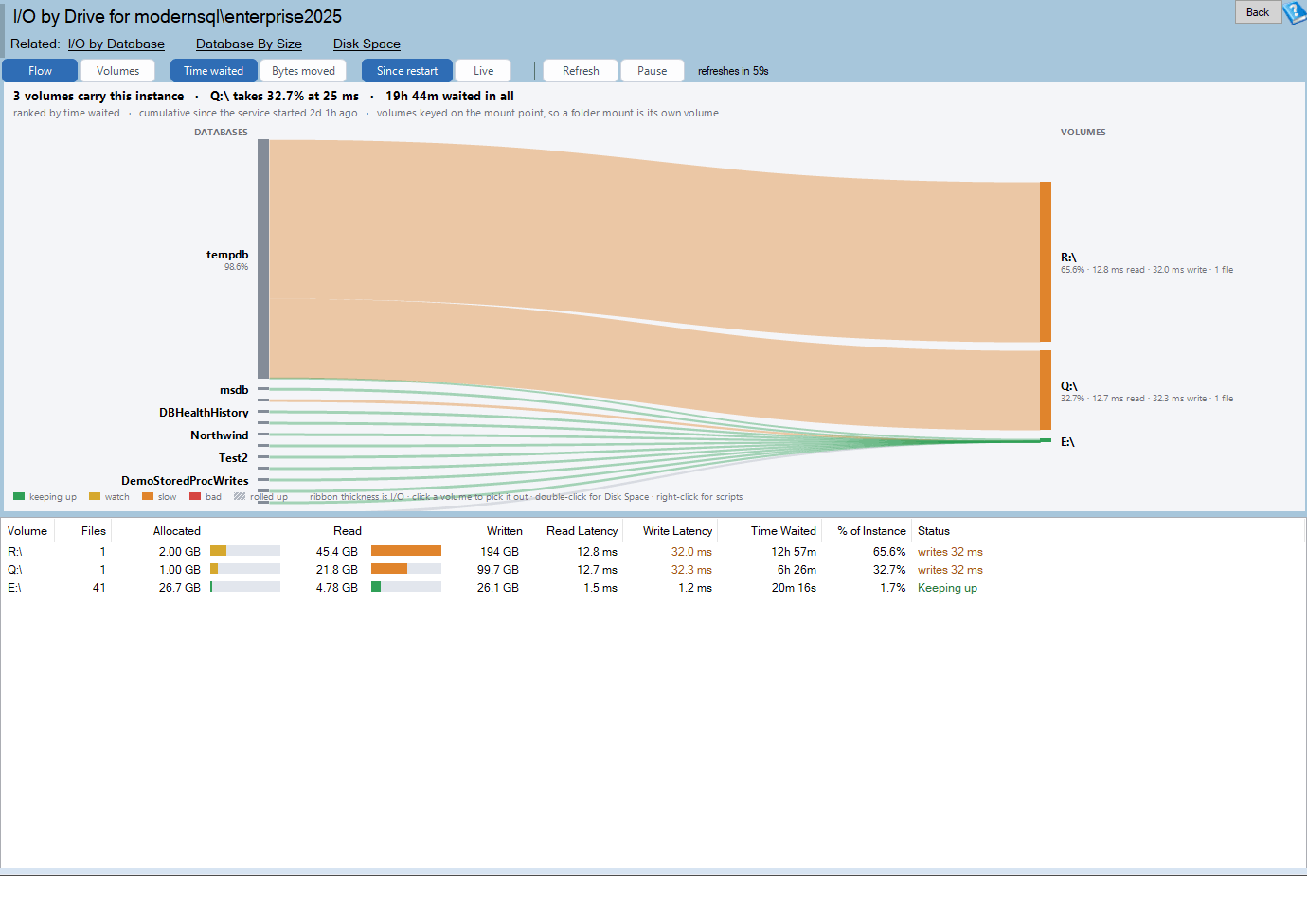
The page title reads I/O by Drive for <server name>. The help button opens https://databasehealth.com/server-overview/instance-level-reports/io-by-drive/.
The chart is also captured into the SQL Server Health Report advisor output, where it sits immediately after I/O by Database. It is skipped on Amazon RDS instances, because mount point information is not meaningful there.
Requirements
- The instance must be online and reachable.
- The login needs
VIEW SERVER STATE. - The query has a 60-second timeout.
- Nothing is installed on the monitored instance and nothing is stored.
The volume lookup is written to survive partial failure:
- It is guarded by a check that
sys.dm_os_volume_statsexists, and the call is made through dynamic SQL so that a missing function on an older SQL Server fails gracefully instead of failing the whole batch at compile time. The report works on versions that predate that function. - The call is wrapped in error handling. An offline volume, or one file you have no permission on, does not cost you the report.
- Any file the function cannot answer for has its volume parsed from the file path instead: a
\\path keeps\\server\share, anX:path becomesX:\, anything else keeps the full path. - Anything still unidentifiable is grouped under
(unknown). - Grouping is case-insensitive, so a case-sensitive collation cannot split a volume.
The two views
The toolbar offers two drawings of the same data. Switching between them does not re-query, so a Live window in progress is not lost.
Flow view (the default)
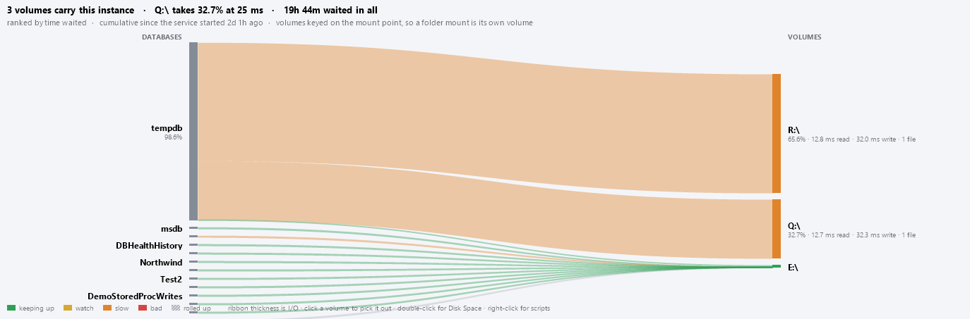
A two-column flow diagram – databases on the left, volumes on the right, ribbons between them.
| Element | What it means |
|---|---|
Left column, headed DATABASES |
One node per database, height proportional to its share of the instance total. Capped at the busiest 12; the rest become one hatched gray node. |
Right column, headed VOLUMES |
One node per volume, height proportional to its share. Volumes with none of the current measure are left out of the diagram (they still appear in the grid). |
| Ribbons | One per database-and-volume pair – the cell of the matrix. Thickness is the amount of I/O; colour is that cell’s latency band. |
Both columns share one scale, so a ribbon is the same thickness at both ends and node heights are directly comparable across the two columns.
Only the volume nodes carry the latency colour. Databases are drawn in a single neutral steel. That is deliberate: colouring both would say a database is slow, and a database is not a thing that is slow – the storage under it is.
Ribbons are drawn translucent and widest-first, so a thin ribbon is never buried under a thick one. Hovering either end brightens every ribbon attached to it.
The rolled-up node is labelled 37 more databases and drawn with a diagonal hatch. Its ribbons are merged into one per volume and coloured neutral gray. Nothing is silently dropped – the ribbons still account for all of the instance’s I/O.
The legend reads: keeping up · watch · slow · bad · rolled up (hatched swatch), followed by the hint ribbon thickness is I/O · click a volume to pick it out · double-click for Disk Space · right-click for scripts.
Node labels carry a second, muted line where there is room:
- A database shows its share, for example
41.2%. - A volume shows more, for example
62.4% · 12.4 ms read · 3.1 ms write · 24 files.
Labels are dropped when a node is too short or when the label would collide with the one above it. The tooltip always works, and a tooltip that always works beats five captions printed on top of one another.
The flow scales to fit the space available – it never scrolls.
When the Flow button turns itself off
The Flow button disables itself when there is only one volume. A flow diagram with a single destination draws a fan and says nothing. On a single-volume instance the report opens on Volumes regardless of your saved preference.
Volumes view
The same diverging read/write bar chart the I/O by Database report draws, with one row per volume: reads run left of a centre axis, writes run right, data files sit against the axis and log files run outward with a diagonal hatch, and colour carries latency.
Axis captions read <- TIME WAITED ON READS and TIME WAITED ON WRITES ->, or <- BYTES READ and BYTES WRITTEN -> when the measure is switched. The legend reads keeping up · watch · slow · bad · log file.
This view scrolls once there are more rows than fit.
The header lines
Both views carry the same three lines above the drawing.
The summary line names the worst volume, which is the sentence you came for:
4 volumes carry this instance · E:\ takes 62.4% at 41 ms · 3h 35m waited in all
The volume named is the slowest of those doing enough work for the average to mean anything – at least 1,000 operations – rather than a volume with four reads on it that happened to be unlucky. If no volume clears that bar, the first volume with any activity is named instead.
The subtitle line states what the numbers cover:
ranked by time waited · cumulative since the service started 6d 4h ago · volumes keyed on the mount point, so a folder mount is its own volume
In Live mode the middle clause becomes live - the last 60 seconds only.
The notice band is amber and appears only when something would otherwise mislead you:
- Live is armed – the first live figures need a second sample, and appear at the next refresh. Until then these are the cumulative totals.
- SQL Server restarted 5h 12m ago – these I/O totals only cover since then. Shown whenever the instance has been up for less than 24 hours.
Latency thresholds
Colour is the average latency of that direction, judged on the right scale for the file type. These are the same thresholds used everywhere else in Database Health Monitor, so a volume that reads red here reads red on the file reports.
| Band | Data files | Log files | Meaning |
|---|---|---|---|
| Keeping up (green) | under 10 ms | under 5 ms | Normal. |
| Watch (amber) | 10 – 20 ms | 5 – 10 ms | Slower than you would like, not yet a problem. |
| Slow (orange) | 20 – 50 ms | 10 – 25 ms | Worth investigating. |
| Bad (red) | 50 ms and over | 25 ms and over | The rows this report exists to find. |
| No traffic / rolled up (gray) | – | – | No operations, so no verdict. |
Every volume is graded on four separate averages – data reads, data writes, log reads and log writes – each against the right scale, and the row takes the worst of the four. A direction with no operations never wins.
Latency averages divide by the operation count only. Adding one to the denominator to dodge a divide-by-zero, as older scripts do, quietly understates the latency on every volume that has done only a handful of reads.
There are no drive-specific thresholds and no free-space thresholds on this report. Free space is the other half of the storage story and lives on the Disk Space report, which is why the chart hint and the double-click both point there.
Chart interactions
Flow view
| Gesture | Target | Result |
|---|---|---|
| Hover | node or ribbon | Attached ribbons brighten; tooltip appears |
| Left-click | volume node | Selects that volume – outlines the node and selects the grid row |
| Left-click | ribbon | Selects the ribbon’s volume |
| Left-click | database node | Nothing |
| Double-click | volume node | Opens Disk Space |
| Double-click | database node | Opens I/O by Database |
| Double-click | rolled-up node | Opens I/O by Database |
| Right-click | volume node | Volume menu, plus Copy Chart to Clipboard |
| Right-click | database node | Database menu, plus Copy Chart to Clipboard |
| Right-click | rolled-up node | No menu |
| Right-click | ribbon, header, legend or empty space | Copy Chart to Clipboard only |
Node hit areas are padded to include the label and grown to a minimum height, so even a thin node stays clickable.
Volumes view
| Gesture | Result |
|---|---|
| Left-click a bar | Selects the volume in the grid |
| Double-click a bar | Opens Disk Space |
| Right-click a bar | Volume menu, plus Copy Chart to Clipboard |
| Right-click empty space | Copy Chart to Clipboard only |
Tooltips
A database node:
AdventureWorks
41.2% of the instance's I/O · 4 files
2h 07m waited · 812 GB moved

Double-click to open I/O by Database.
A volume node:
E:\
62.4% of the instance's I/O

Reads 4.2M ops · 812 GB · 12.4 ms
Writes 980,112 ops · 210 GB · 3.1 ms

18 data, 6 log · 1.2 TB allocated

Double-click to open Disk Space.
A ribbon – the number neither margin could give you:
AdventureWorks → E:\
1h 12m · 3 files on this volume

Reads 12.4 ms
Writes 3.1 ms
Reading the grid
| Column | Units | What it is |
|---|---|---|
| Volume | – | Mount point, for example E:\ or \\server\share, or (unknown). |
| Status | – | log writes 34 ms-style chip, or Keeping up, or Idle. |
| Files | count | Database files on this volume, data and log together. |
| Allocated | bytes | Sum of the sizes of those files. This is file allocation, not volume capacity. |
| Read | bytes | Bytes read from all files on the volume. Drawn with an in-cell bar. |
| Written | bytes | Bytes written to all files on the volume. Drawn with an in-cell bar. |
| Read Latency | milliseconds | Read stall divided by read operations. - when there were no reads. |
| Write Latency | milliseconds | Write stall divided by write operations. - when there were no writes. |
| Time Waited | ms / s / m / h / d | All read and write stall across every file on the volume. |
| % of Instance | percent | Share of the instance total for the current measure. Under 0.1% shows as <0.1%. |
Layout. Status comes straight after Volume, and the wide bar columns follow it, so the verdict for each volume is on screen at 1280 x 900 without scrolling sideways however long the volume label is. Volume and Status are capped in width, and the full text of any row shows in the tooltip when the mouse rests on it.

Idle for a volume holding only untouched files.Note the difference from I/O by Database: Allocated is the total size of the database files sitting on the volume, not how big the volume is and not how much room is left on it. For capacity, use Disk Space.
Highlighting
- Read and Written draw a horizontal bar behind the number, both scaled against the same maximum so the two columns are comparable, filled with the latency-band colour for that direction.
- Read Latency and Write Latency print in the band colour only when that direction is slow or bad.
- Status is red for bad, orange for slow, green otherwise – including for Idle.
Idle volumes are kept
Unlike I/O by Database, which drops databases that did nothing, every volume stays in the grid even if no file on it has been touched. A volume holding only idle files is a fact about the storage layout worth seeing. Idle volumes are omitted from the flow diagram, because a node with no thickness cannot be drawn.
Sorting, filtering and copying
- Click a column header to sort; click again to reverse. Sorting uses raw values, so
3h 35msorts above842 ms. - Right-click a column header for Filter… and Reset Filters.
- Right-click the grid for Copy, Copy with Headers (tab-separated, pastes straight into Excel), Select All, Filter ‘<column>’ and Reset Filters, followed by the volume-specific items.
- Double-click any grid row to open Disk Space.
Selecting a row highlights the matching node or bar in the chart, and vice versa.
The toolbar
| Button | What it does | Re-queries? |
|---|---|---|
| Flow | The database-to-volume flow diagram. Disabled when there is only one volume. | No |
| Volumes | The diverging read/write bars, one row per volume. | No |
| Time waited | Rank and size by milliseconds waited. The default. | No |
| Bytes moved | Rank and size by throughput. | No |
| Since restart | Cumulative counters. The default. | Yes |
| Live | The difference between two samples. | At the next tick |
| Refresh | Reload now. | Yes |
Next to them a countdown reads refreshes in 42s, or next sample in 8s in Live mode. The report refreshes itself every 60 seconds by default.
There is no Top N control on this page. Volumes are few, and none of them is dropped even when it has done no I/O at all. The Flow / Volumes pair takes that place on the toolbar.
Since restart and Live
Since restart shows the counters as SQL Server keeps them, cumulative since the service last started. It is available the moment the page opens, and it describes history rather than now.
Live keeps the previous sample and draws only the difference.
- The first Live reading needs two samples. The amber notice band says so, the cumulative totals stay on screen, and the first live figures arrive at the next sample – pulled forward to 10 seconds.
- The baseline rolls forward every refresh, so a Live window is exactly one interval long.
- If a counter goes backwards, the service restarted; the comparison is discarded and the page starts again rather than drawing a negative.
- Elapsed time uses the server’s clock, so clock skew between your workstation and the instance cannot fabricate a rate.
- Switching between Flow and Volumes preserves a partly-elapsed Live window.
The measure and Live choices are shared with I/O by Database, on purpose. Following a link from one report to the other is not a change of mind about what you want to be looking at.
An auto-refresh is suppressed while a right-click menu is open.
Right-click actions
On a volume:
| Item | What it does |
|---|---|
| Open Disk Space | Opens the Disk Space report. |
| Copy Volume Name to Clipboard | Just the mount point. |
| Copy Files On This Volume Script to Clipboard | A read-only T-SQL script listing every database file on that volume, worst waiting first. |
| Copy Chart to Clipboard | (chart only) The chart as an image, in both bitmap and PNG form. |
On a database node in the flow:
| Item | What it does |
|---|---|
| Open I/O by Database | Opens the per-database report. |
| Copy Database Name to Clipboard | Just the name. |
| Copy File I/O Breakdown Script to Clipboard | A read-only script listing every file in that database, worst waiting first. |
| Copy Chart to Clipboard | The chart as an image. |
The volume script returns database name, logical name, physical path, whether the file is data or log, read and write counts, average latencies and total stall, ordered worst first. The path is escaped for the LIKE pattern it goes into – an underscore in a folder name is common and would otherwise match any character, quietly pulling in files from a volume you did not ask about.
Both scripts are read-only. There is no action to script here, because the fix for slow storage is never a statement.
How to read the report
- Read the summary line. It names the worst volume, its share and its average latency in one sentence.
- Check the subtitle. Cumulative or live? How long has the instance been up?
- Look at the volume column colours. If one volume is red and the others are green, the problem is that volume. If everything is red, the problem is the storage as a whole.
- Follow the ribbons into the red volume. The thickest ribbon arriving at a slow volume is the database making the most of the demand on it – and often the one that can be moved.
- Look for a thin ribbon into a red volume. A database with little I/O landing on badly performing storage is being punished for where its files happen to live, not for what it does.
- Check the
AllocatedandFilescolumns. A volume with many files from many databases is a contention candidate before it is a hardware candidate. - Switch to Bytes moved. High waiting with low throughput points at the storage; high throughput with proportionate waiting points at the workload.
- Switch to Live to confirm the problem is current rather than historical.
- Drill out. Double-click a volume for Disk Space to see capacity, or copy the volume script and run it in SSMS for the file-by-file detail.
Common patterns
One volume red, one database’s ribbon is most of what lands on it. The clearest finding this report produces. Either move that database’s files, or find out what that database is doing to generate that much I/O.
One volume red, ribbons arriving from a dozen databases. Contention, not a single culprit. The volume is oversubscribed. Spreading files or upgrading the storage will help more than tuning any one database.
A log-file volume red while the data volume is green. Log writes are synchronous and serialised – every commit waits on one – and are judged at half the data-file thresholds. This is worth acting on even when the numbers look modest.
A volume called (unknown). The mount point could not be read and the path could not be parsed. Usually a permission problem on sys.dm_os_volume_stats or an unusual path form.
More volumes than you expected. Correct behaviour, not a bug. Folder mounts are counted as themselves rather than collapsed onto the drive letter they hang off. The subtitle line says so.
A volume showing Idle. Files live there but nothing has touched them since the counters were reset. Worth knowing about – it is often an archive volume, a detached-and-reattached database, or a file nobody remembered was there.
Where the data comes from
The report runs one query against the monitored instance on every load and refresh, using a connection outside the connection pool. Nothing is stored.
sys.dm_io_virtual_file_stats– reads, writes, bytes and stall milliseconds per file.sys.master_files– logical name, physical path, size, and whether the file is data or log.sys.dm_os_volume_stats– the mount point for each file, with path parsing as the fallback.sys.databases– the creation date oftempdb, used as the service start time behind the uptime text and the restart notice.
This is exactly the same query the I/O by Database report runs. That report takes the row totals of the matrix, this one takes the column totals, and the flow diagram draws the cells.
The counters are cumulative since the SQL Server service started and reset on restart. Because nothing is stored, Live cannot look backwards; for storage latency over days or weeks use Disk Latency by Hour by Day.
Settings
| Setting | Default | Values | Set by |
|---|---|---|---|
IoDriveView |
flow |
flow, volumes |
The Flow / Volumes buttons. Unique to this report. |
IoChartMeasure |
waited |
waited, bytes |
The Time waited / Bytes moved buttons – shared with I/O by Database |
IoDeltaMode |
cumulative |
cumulative, live |
The Since restart / Live buttons – shared with I/O by Database |
IoRefreshInterval |
60 |
seconds, minimum 10 |
Hand-edited only – shared with I/O by Database |
These live in the per-user settings file in your Documents folder. Unrecognised values fall back to the default, and a refresh interval below ten seconds is ignored.
Dark mode and colour-blind mode change every colour but never the thresholds.
Messages you may see
No volumes could be read:
No volumes holding database files could be read. This needs sys.dm_io_virtual_file_stats and sys.master_files, which both require VIEW SERVER STATE.
The toolbar stays and the countdown keeps running, so the page recovers on its own if the cause was transient.
The query timed out:
The file I/O lookup did not finish in time. An instance with a great many database files can take a while; try Refresh.
This appears on the first load only. A background auto-refresh that fails is silent rather than interrupting you.
In the chart body: No I/O to show.
Related reports
| Report | Why you would go there |
|---|---|
| I/O by Database | The other margin of the same matrix – per database rather than per volume. |
| Disk Space | Capacity and free space. This report says how hard a volume is working; that one says how much room it has left. |
| Databases by Size | Which databases account for the allocation on each volume. |
| Disk Latency by Hour by Day | Historic latency – which hours of which days storage is worst. |
| File Utilization | File growth and free space inside the files themselves. |
Frequently asked questions
Why is the Flow button grayed out? There is only one volume. A flow diagram with a single destination is a fan, and says nothing. The report opens on Volumes instead.
Why does the flow show only twelve databases? Past a dozen, the ribbons are thinner than their own labels and the diagram stops being a diagram. The rest are rolled into one hatched node that is drawn and named, so nothing is silently dropped. Double-click that node to open I/O by Database and see all of them.
Why is a volume in the grid but not in the flow? It has none of the current measure – no waiting, or no bytes. A node with no thickness cannot be drawn. Volumes are never dropped from the grid.
Why do I see more volumes than I have drive letters? Because folder mounts are counted as themselves. That is the point of keying on the mount point.
Why is Allocated smaller than my drive? It is the total size of the database files on that volume, not the size of the volume. Use Disk Space for capacity and free space.
Why are the database nodes all the same colour? Because colouring them would say that a database is slow, and a database is not slow. The storage under it is. Only the volume nodes carry a verdict.
Can I export this? Right-click the grid and choose Copy with Headers, then paste into Excel. For the chart, right-click and choose Copy Chart to Clipboard.
Why is this section missing from my SQL Server Health Report? Either the instance is Amazon RDS, where mount points are not meaningful and the section is skipped, or the report was captured while the page was on the Volumes view, in which case the description and the grid are included without the flow image.